The exercise books with empty pages…
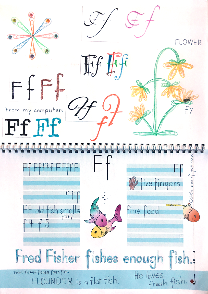
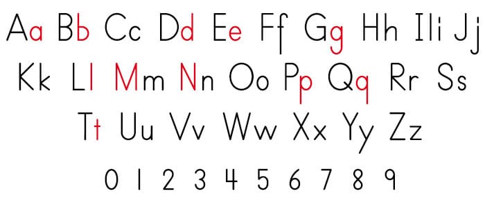
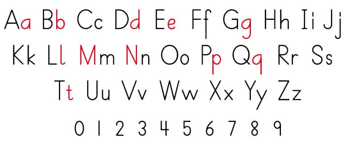
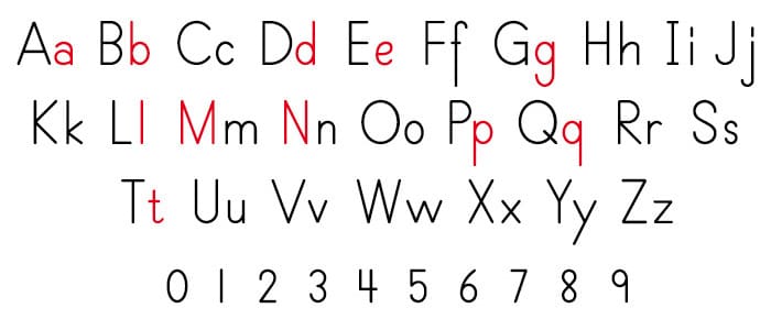
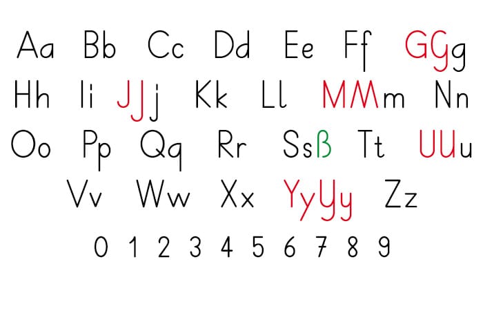
…and their selectable fonts.

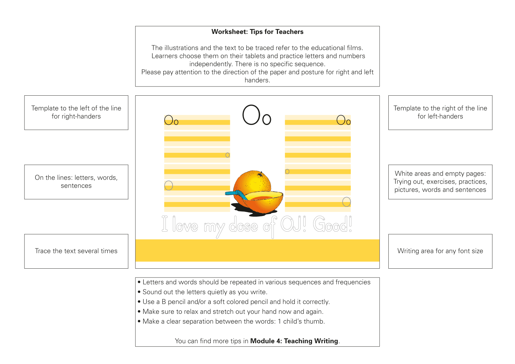
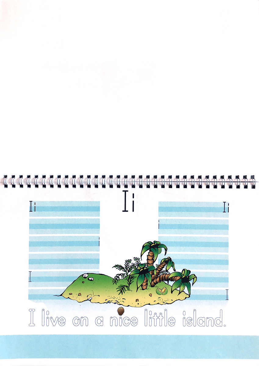
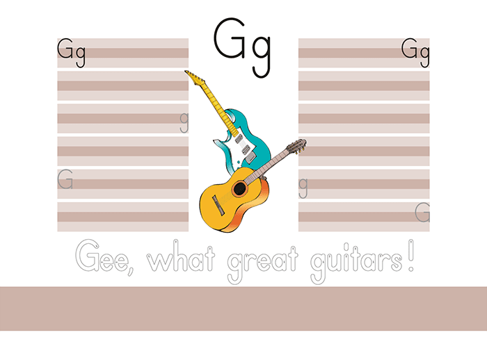
The exercise books contain a practice page for each sound of the alphabet and a sheet for the numbers.
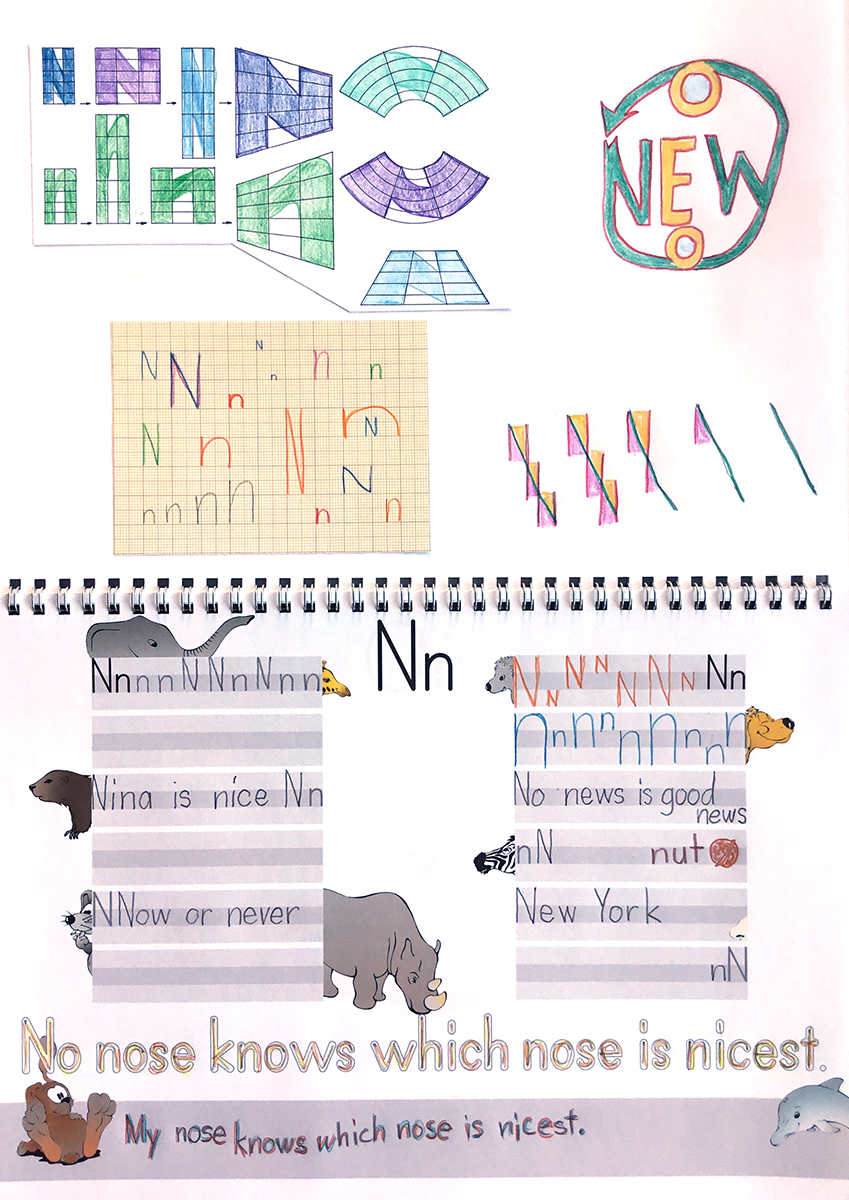
The illustrations match the themes in the films and are also representations of the initial sounds.
The writing lines are kept short intentionally, as page-long practice lines for a single letter are nerve-racking for children as well.
Teachers and other supervisors are advised on the info page (above left) to encourage the pupil to write the upper-case and lower-case letters in the lines alternately, at irregular intervals and mixed up in words and sentences.
The empty spaces are used for supplementary elements from the handwriting lessons. The booklet, which initially looks the same for everyone, becomes each child’s individual «writing portfolio» over the course of the school year.
The coloured strips on the pages can be used to repeat the accompanying sentence without lines and in whatever size the pupil wishes.
A4, at least 30 sheets depending on the font choice
4-color spiral binding, protective film at the front, cardboard at the back
| 1 – 9 | CHF 18.– |
|---|---|
| 10 and more | CHF 12.– |
print-on-demand order now